Building Relationship Graphs in Python with NetworkX
No ads, no tracking, and no data collection. Enjoy this article? Buy us a ☕.
One of the thing I've been working on at work is something we call an object attribute mapper. For medical education, it's important to be able to attach meta data (attributes) to various data points (objects), and sometimes the attributes themselves have attributes, creating this web of relationships that allow you to roll up mappings in order to track data changes across time, and report on the relationships of quantitative scores.
Python has an excellent library to map relationships called networkx. It's a network mapping utility that works great for defining relationships by nodes and edges, and it's really easy to get started.
import networkx as nx
      import matplotlib.pyplot as plt
Let's say we want to map out the meta data for an individual object. In this example, I'm going to use a question from an exam, and I'm going to pull that data from a data frame that's already been loaded into pandas called relationships.
r = relationships[relationships['Object'] == 14852]

      edges = []

      for idx, rr in r.iterrows():
              edges.append((rr['Object'], rr['AttributeName']))
In the above code, I'm pulling out all of the relationships associated with the object ID 14852. I create an empty array, and then I iterate over the pandas extraction, appending a tuple of two data points to the edges array. These two data points represent nodes in the network graph, and it's a relationship from one node to the other.
Now we can create the graph.
g = nx.DiGraph()
      g .add_edges_from(edges)
Once you have the graph created, you need to display it. NetworkX is built on top of Matplotlib, so just like that library, this one requires you to show or render the graph explicitly after you have created it.
plt.figure(figsize = (20, 10))

      nx.draw(g, with_labels = True, node_size = 5000, font_size = 20)
      plt.show()
Notice that I use the Matplotlib library to adjust the figure and show the network graph.
With this, you'll end up with a network graph that looks something like this:
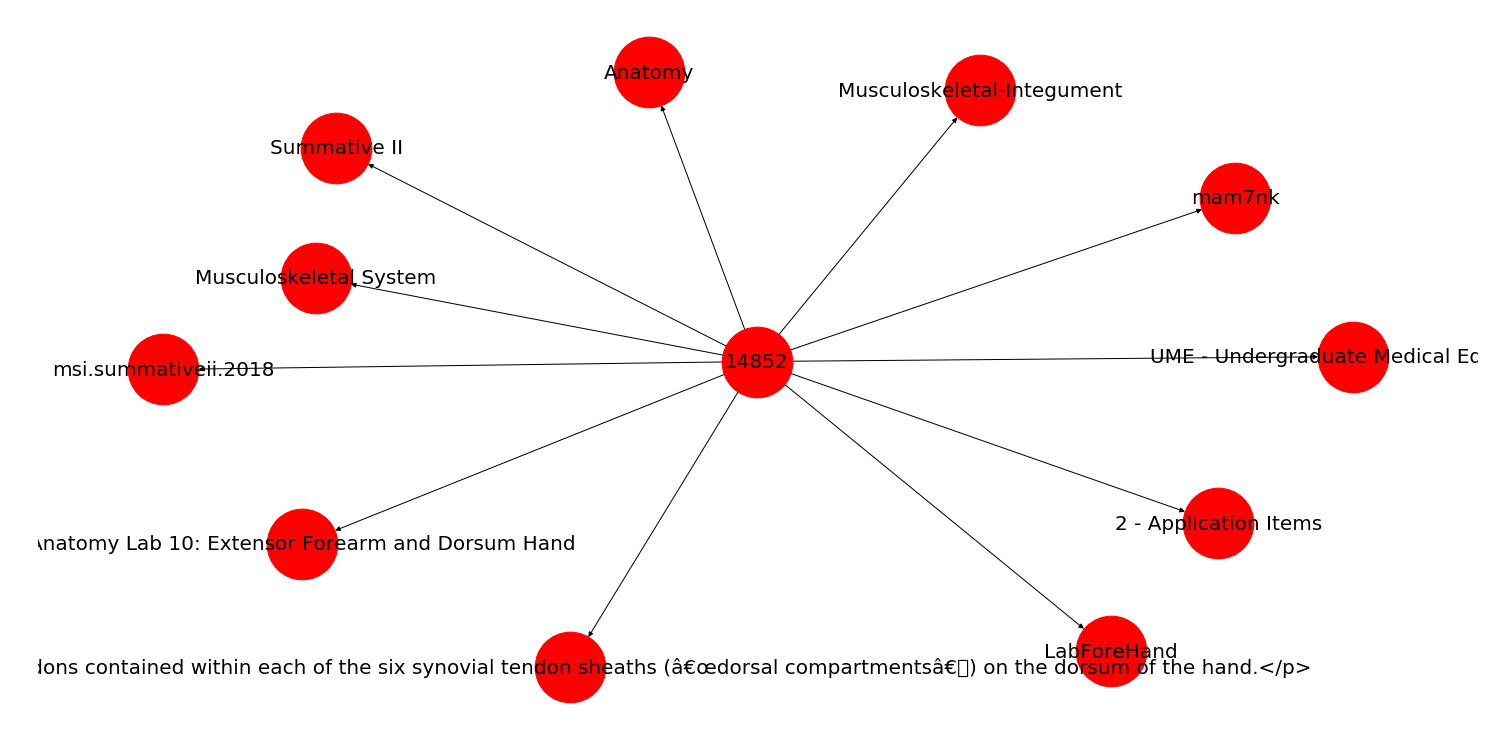
In the above graph, all of the relationships point to a central hub (the question ID), but if you had attributes that related to other attributes (i.e., a variance in the node relationships), it could look something like this:
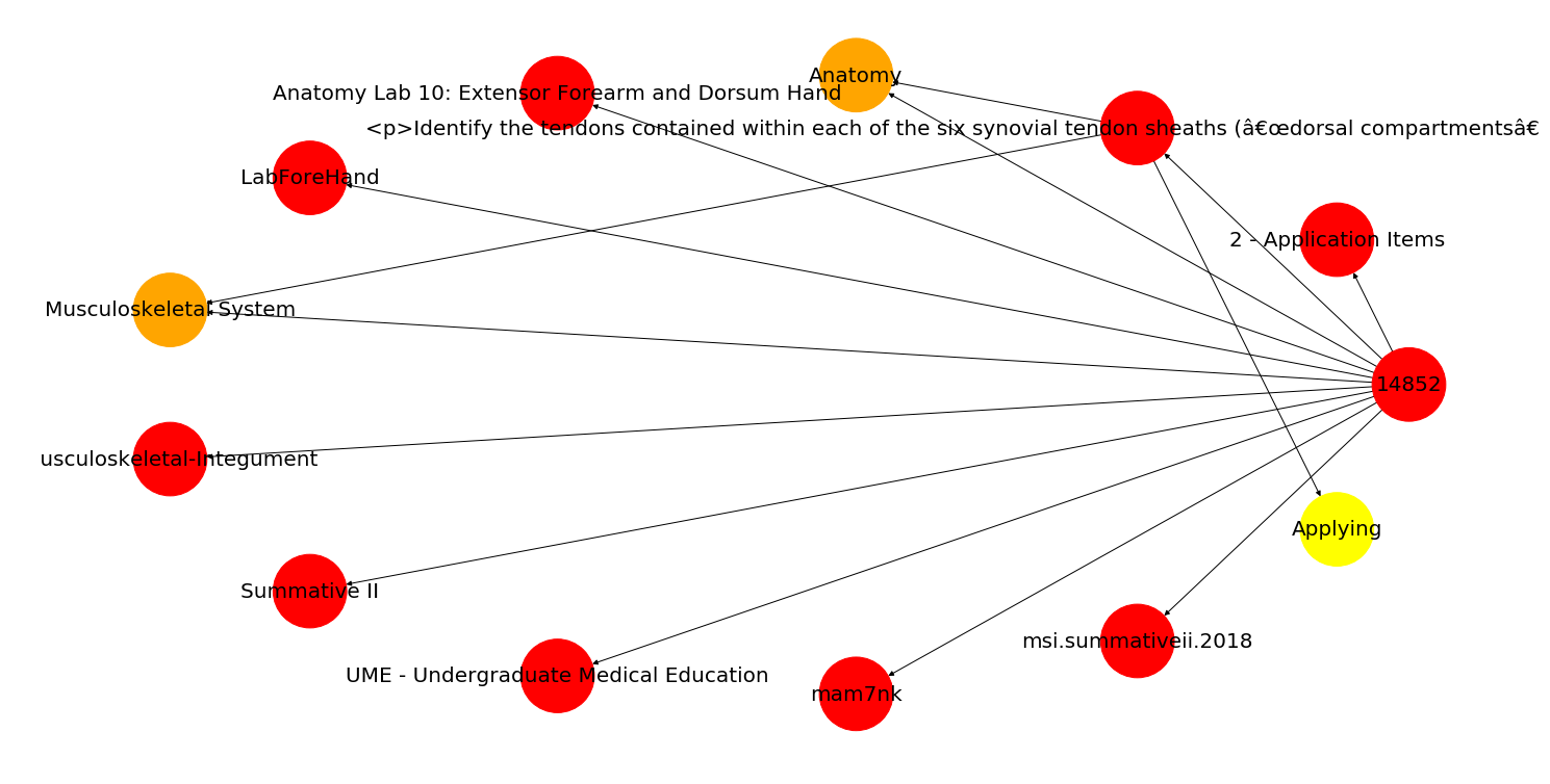
Just note that this second diagram uses draw_circular() instead of draw(), and we've added a little color to the nodes to make a few stand out.